Color & plain color (1)
NAME:
How to choose a good home color collocation?
Product details
Accent color
Recurring
The operation is very simple: a large black, white and gray base + a key color. Black and white ash can be regarded as a "disappearing state" in the color system. Choosing black and white ash as a large base for wall color, ceiling and large-area soft furnishings is equivalent to creating a blank canvas. At this time, you can fill it with anything. Nothing is wrong.
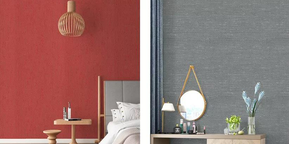
Next, as long as you choose a color you like as the key color and let it appear repeatedly, it will give people a feeling of "this home is so designed!" "The owner's taste is great!"... Black and white gray + blue, black and white gray + yellow, black and white gray + pink, black and white gray + gold are all good choices.
2
Homologous
Superimpose the most harmonious
Some people think that the big white wall is too boring and want to paint some color to create a sense of freshness. Once the "canvas" has a color, then the matching of furniture will have higher requirements. The safest way is to superimpose the same color system: choose household items of the same color as the wall, which can be different in shades, but should generally be controlled within the same color system.
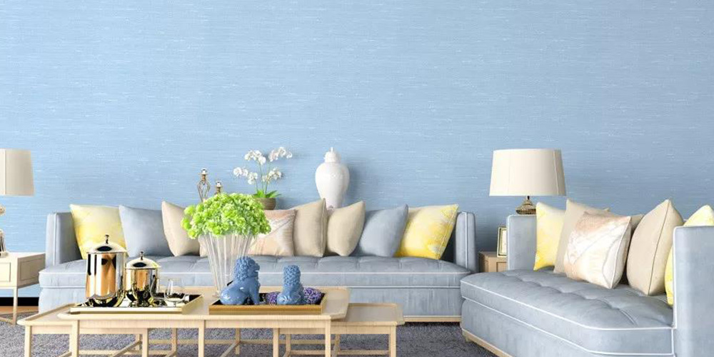
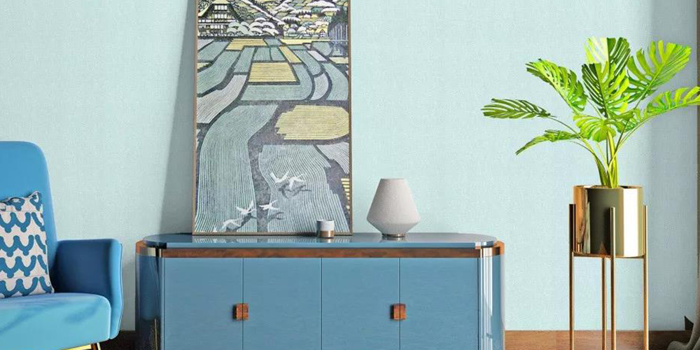
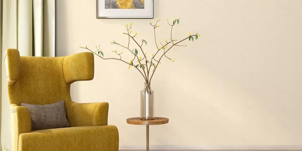
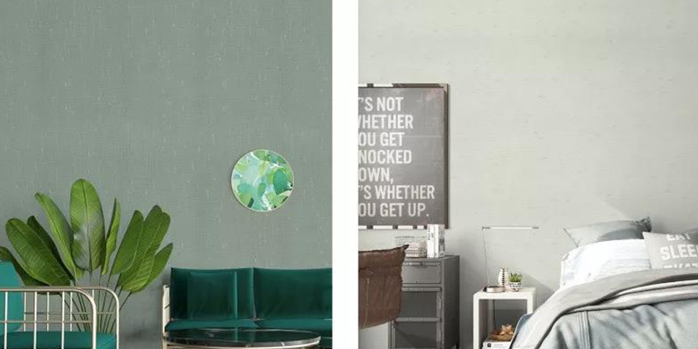
There is a Japanese lacquer artist named Akagi Minto. He said "beauty is restraint." At first glance, you may not understand it, but when you consciously design a work and think about how to match colors more reasonably, it is actually a kind of "restraint". I understand the mood of looking good in any style and wanting to try any color, but please remember that there must be reasonable logic behind the beauty, rather than being too arbitrary.
3
Bold color
Surprise harvest
Color collision is considered a high level of color matching. Friends who want to collide should at least have some sensitivity to color. Of course it's the old saying, you can't just bump into it. Here are a few of the most commonly used and best-effect combinations, which can be easily mastered if you don’t understand the color principle.
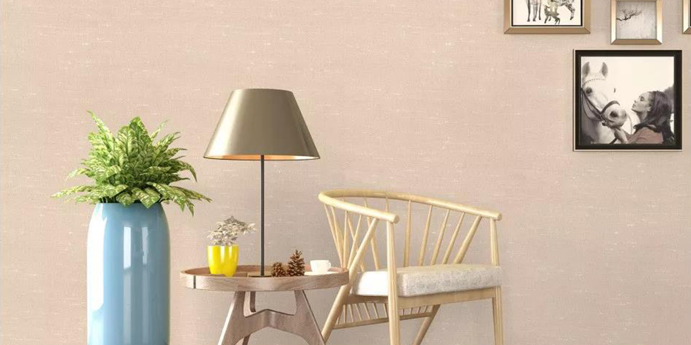
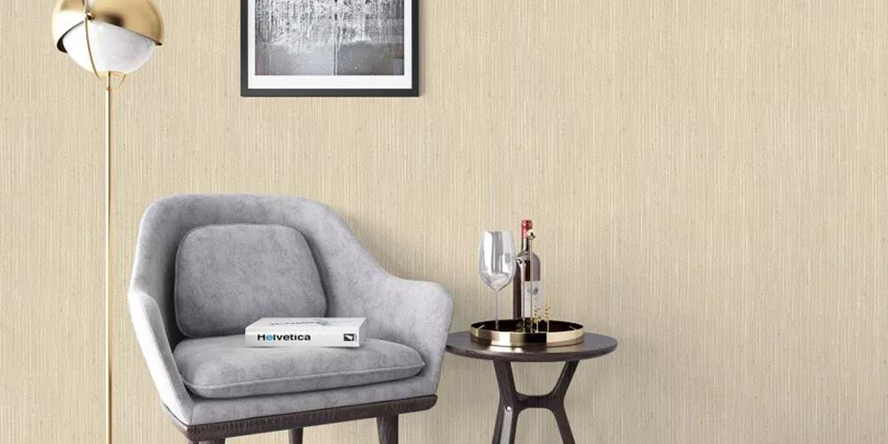
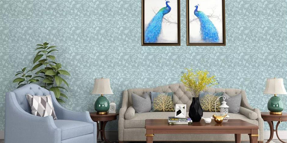
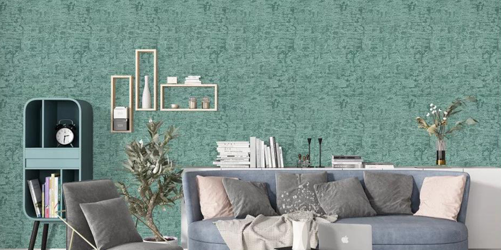

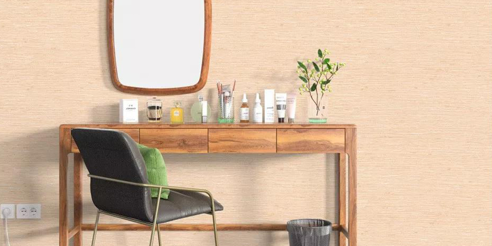
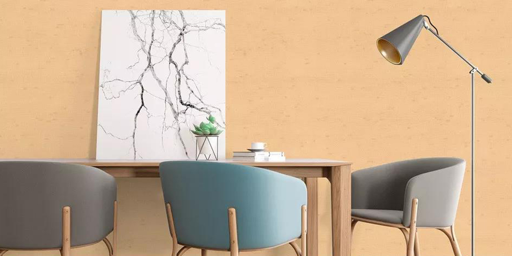
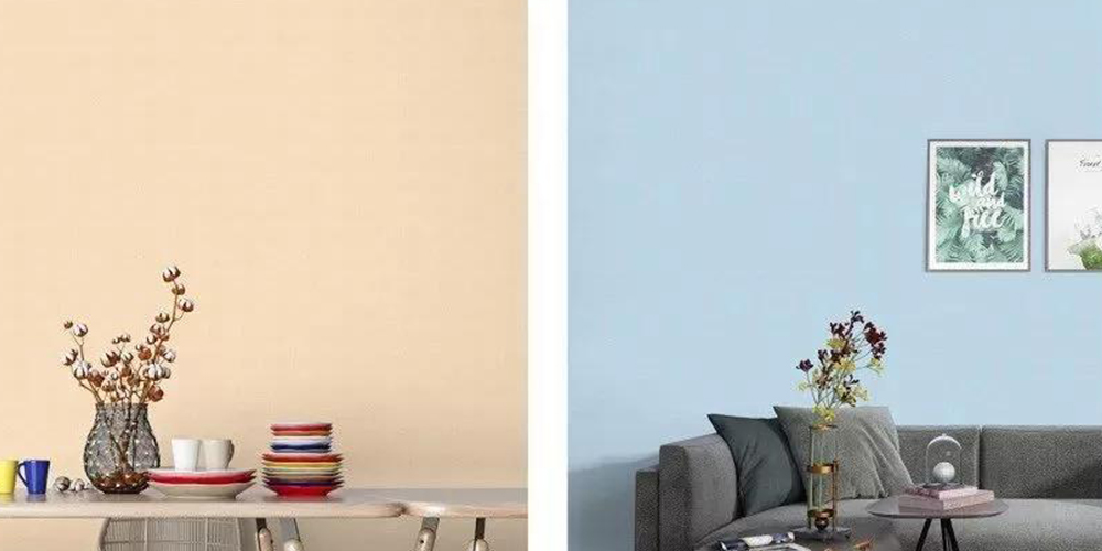
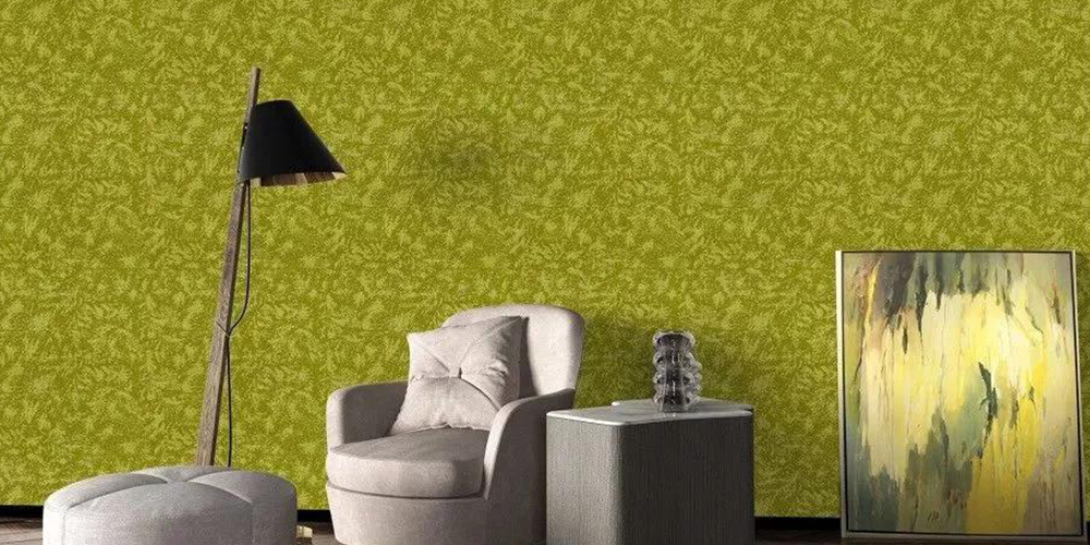
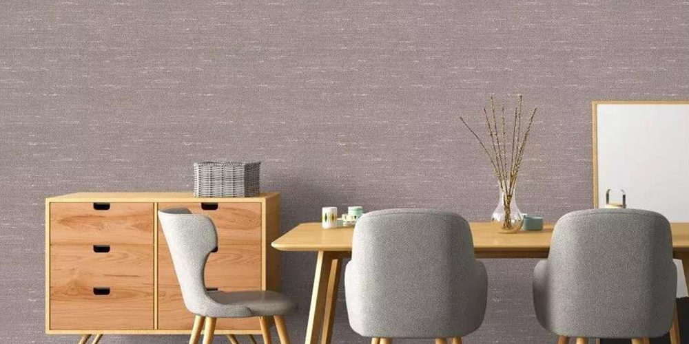
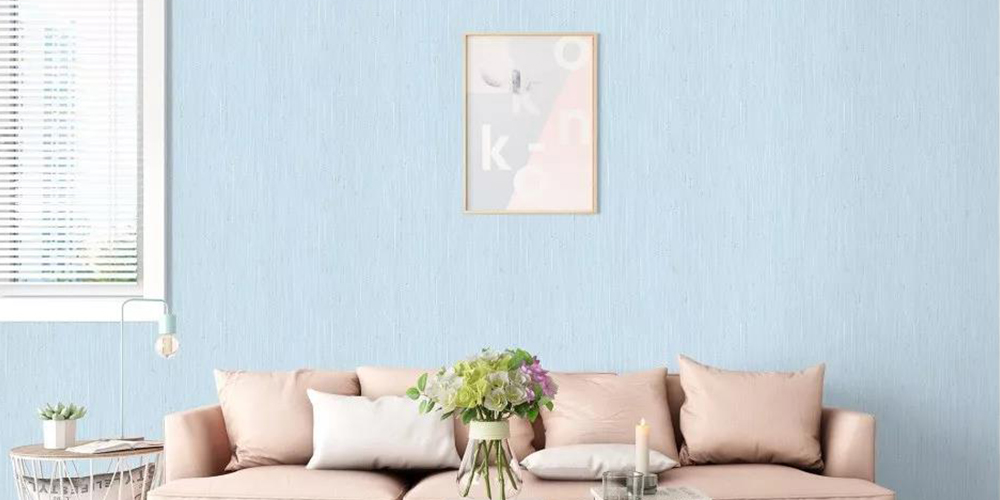

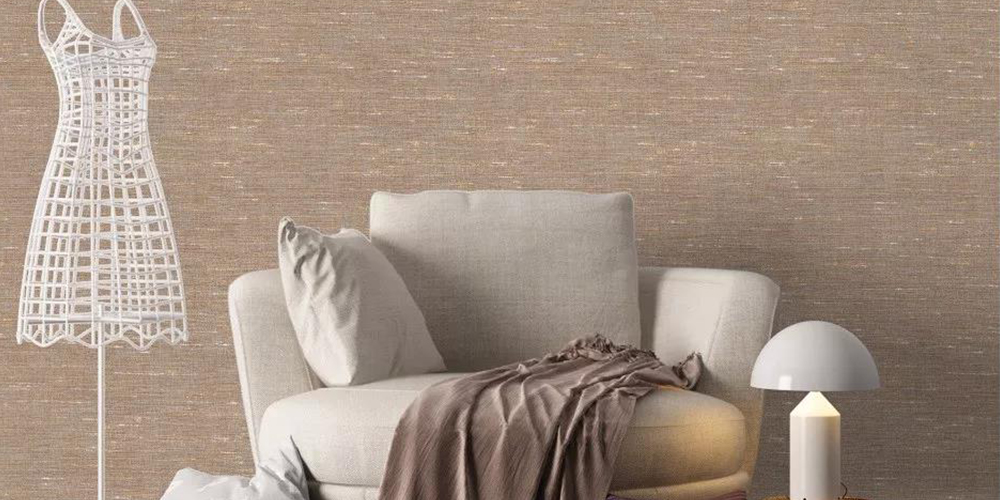
Contrasting colors can't be hit with high-purity colors, it always gives people a feeling of losing both sides, the impact is enough but not pleasing to the eye. Blue+red, pink+gold, green+orange are all good contrast colors.